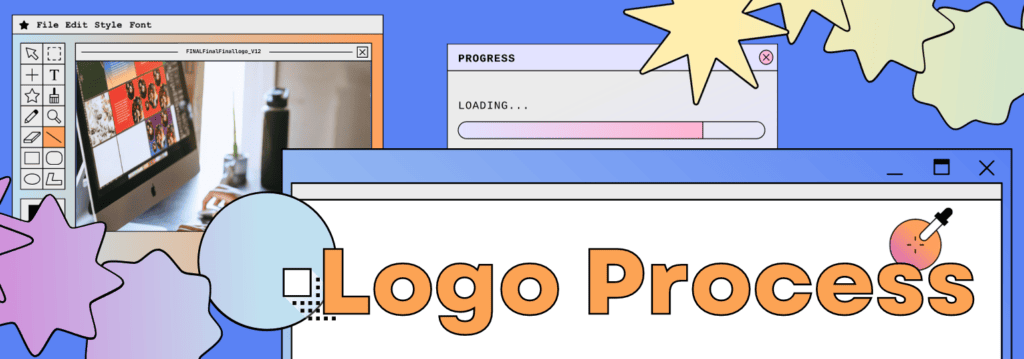
Sketches to Icons: Breaking Down Logo Creation
Logos wield an extraordinary power—the power to make us recognize, trust, and love a brand at a mere glance. But what goes into creating a logo that can leave such a mark in our minds? I’m peeling back the layers of logo design, and my tips and tricks to creating a memorable logo!
Step 1: Understand the brief
The process begins with a thorough understanding of the client’s requirements, values and target audience. In the beginning, your job is to ask every question you might have about the business and brand—its story, vision, goals and aesthetic. This process can be lengthy (and should be!) to ensure you’ve covered all the bases. You have to get to know someone (or something) before you can fully capture who they are. This is why discovery meetings are so important! From here, create a long list of keywords from conversations with the client and the team, which can help guide you into the next phase.
Step 2: Research and trends
Research and inspiration gathering really involves exploring the company’s industry, competitors, and trends. Not sure where to start? Try these steps:
- Studying industry trends ensures what we’re doing is current, resonates with audiences, and reflects the visual language of the time. By understanding what’s popular and evolving, you can infuse your designs with relevance within the contemporary landscape.
- Scrolling through platforms like Instagram, Pinterest, and really any design inspiration websites. This is truly essential during the research and inspiration phase because it exposes you to diverse styles, trends, and creative approaches. Plus, who doesn’t scroll for endless hours anyway?
- Exploring physical spaces like bookshops enriches the research and inspiration phase by providing tactile and tangible experiences. This hands-on approach exposes you to design elements that might not be as prevalent online. Engaging with printed materials, textures, and layouts in real-world environments fosters a deeper understanding of design principles, enabling you to pour authenticity and uniqueness into creative projects.
- Mood boards!
Step 3: sketching and concept
Now you can put away the computer for a while and dive into the fun part—where ideas come to life on paper! Something I’ve learned to do is set a timer and capture the initial burst of creative thoughts directly onto paper. This allows for quick exploration of various ideas without any digital limitations. There’s a freedom to sketching that helps with the fear of making mistakes since there are no ‘undo’ buttons. Sketching and concepting really creates a bridge between creative thoughts and the final design.
Don’t filter yourself, put everything down. You won’t know if an idea is great or terrible unless you try it! Even terrible ideas can spawn new ideas that are awesome. My theory is that the messier the paper is, the clearer the end result will be. The human mind is abstract and if you give it the necessary freedom to make a mess, it’ll eventually find clarity.
When you finish sketching, ask yourself: which sketch best matches the project and why? Which one doesn’t and why? Which logotype is the most legible and which one is the least legible? If you were to finalize these sketches, would they all work in small sizes? Are they anatomically correct?
After choosing a few options, start cleaning up the selections: make its outlines smooth, get rid of any major inconsistencies and even out the spacings and grids. You don’t have to make everything pixel perfect, you just have to make the sketch close enough to the final result.
Step 4: Time to go digital
Now that you put your ideas on paper, it’s time to give them a digital facelift. Taking them into Illustrator allows you to recreate the sketches, experimenting with variations in shapes, sizes, and typography. This maintains the raw essence while allowing you to manipulate the logos exactly how you want, ensuring a more refined look. When working on these digital comps, try to stick with black and white. This way, you can really focus on the core elements of the logo without getting caught up in color, which will come later. This ensures that the logo’s structure, balance, and readability are solid and can stand on their own. It’s a smart approach because it helps to see how effective the logo is without any color distractions. This is especially important because you want the logo to work well in any situation, no matter the variation or context.
Step 5: Feedback and iteration
Gather feedback and begin refining the logo based on the suggestions received. This might involve adjusting proportions, tweaking elements, and fine-tuning typography. The goal is to evolve the design, taking it from a promising concept to an enhanced and impactful logo.
Start introducing different layout and color variations with 2-3 chosen logo options. This is where the logo starts coming to life with its visual identity. Then, select colors that resonate with the brand and its intended message. These variations allow you to explore the logo’s adaptability across diverse contexts, ensuring it remains impactful and consistent.
Step 6: Finalize!
Time to get things perfect! Finalizing the logo involves refining the chosen concept and transforming it into a polished design. Dive into refining every layout and mark, making sure they’re top-notch in terms of looks and alignment.
Once satisfied, save the logo in different layouts and formats – from online platforms to print materials.
And voila! A thoughtful, creative-led logo perfect for your brand to connect with your target audiences. Easy as pie!